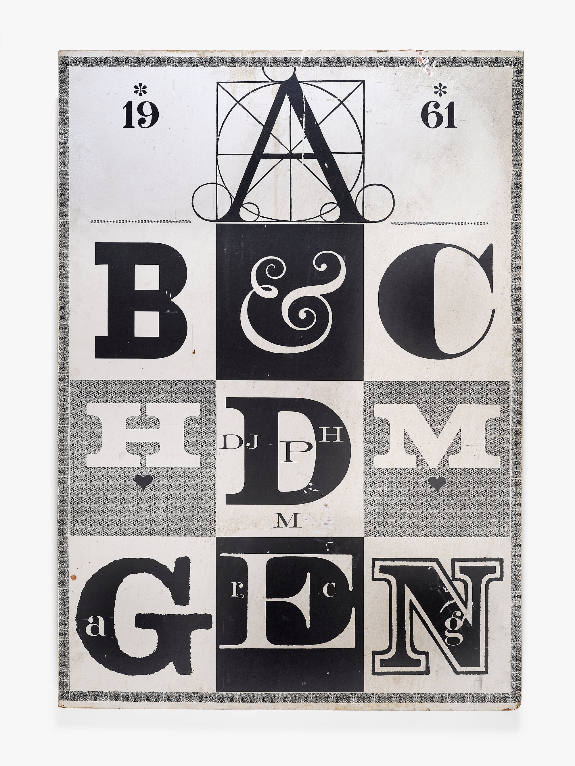
ABC Graphic for Herman Miller
1961
The Eameses believed that the responsibility of a designer extended to the thoughtful presentation of their designs to the public, through channels like advertisements and showrooms. On many occasions the Eameses staged the Herman Miller showroom in Los Angeles, and this poster was designed for display there in 1961. It plays with the format of a classroom alphabet chart; after the expected opening sequence of “AB&C,” the rest of the alphabet is replaced by initials that refer to Herman Miller and friends. The white “H” and “M” stand for the furniture company itself. Between them, the firm’s founder D. J. De Pree is represented, with a second “H” and “M” that are perhaps meant to reference De Pree’s father-in-law, Herman Miller, for whom the company was named. The bottom row references several designers close to the company: Alexander Girard, Ray and Charles Eames, and George Nelson. The letterforms themselves have intriguing sources. The “A” is borrowed from Leonardo da Vinci’s illustrations for mathematician Luca Pacioli’s 1498 book on the Golden Ratio, De Divina Proportione (On the Divine Proportion), and the “B” comes from the logo Paul Rand designed for IBM in 1956. Altogether, the poster displays Ray’s propensity for lively juxtaposition of styles and reads as a celebration of designers both past and present.
- Manufacturer: Office of Charles and Ray Eames
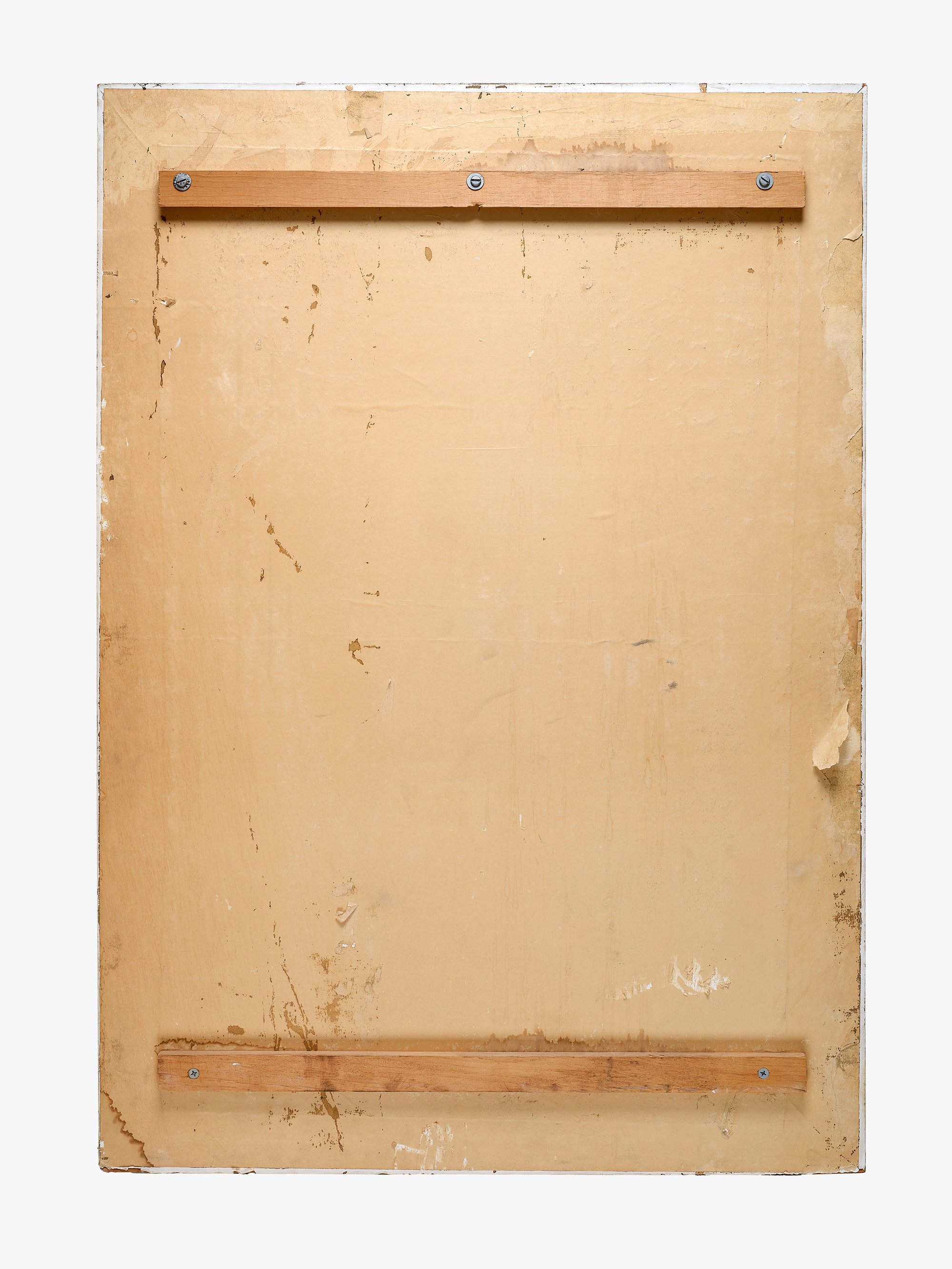
- Medium:Printed paper
- Dimensions:48 x 33 1/2 x 1 1/2 in. (121.9 x 85.1 x 3.8 cm)
- Item:2019.2.358

