Exhibition 04
Return to Sender
The Eames Collection contains hundreds of postcards ranging from marketing materials Ray and Charles created for the Herman Miller Furniture Company to souvenirs they bought during their travels and items printed by third parties featuring their exhibitions and furniture.
This ephemera represents a cross-section of the world of the Eameses—their designs; their family, friends, and associates; and the fandom that surrounded their work—all told through a few square inches of paper.
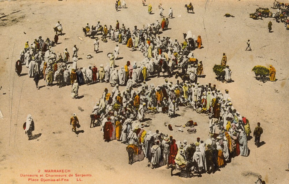
Correspondence dates back millennia, but postcards originated in the mid-19th century as a less expensive and more casual alternative to letters—the equivalent of sending a quick text or a DM today. These short notes represent a democratic form of communication. Postcards began as very simple designs, with one side reserved for an address and the other for a message, which was either handwritten or pre-printed. Beyond a way to keep in touch, postcards became collectible souvenirs in the United States after the 1893 Chicago World’s Fair, when publishers realized the millions of visitors were eager to buy memorabilia from their trips to the pavilions. The format we recognize today, with an image on the front and address lines and a message field on the back, was permitted by the postal service in 1907, which ushered in a “golden era” of postcards that lasted until World War I. Postcards made during that time featured illustrations of political messaging, cartoons, advertisements, mundane objects, and spectacular monuments and landmarks. By some estimates, 200 billion postcards circulated during the early 20th century, creating what the historian Lydia Pyne describes as the first social network: a global exchange of images and messages. At the time, image-based media was still rare—even in newspapers—and postcards offered a glimpse of the world. As photography became more accessible commercially in the 1930s, photochrom prints replaced drawings; eventually full-color photography replaced photochrom in the 1940s. The availability of more images, plus World War II, paved the way for another postcard craze as they were free for soldiers to send. Postcards still enjoyed popularity during the second half of the 20th century, even as cameras grew to be popular consumer items. Starting in the 1990s, as email started to rise, postcards began to decline in use for personal correspondence. And each time we post a photo and caption to Instagram, we’re effectively making our own postcards. Still, postcards are far from obsolete; they’ve just taken a different form, mostly bulk political mailers and advertisements.
Communication is a fundamental aspect of Ray and Charles’s work, from their films to exhibitions and lectures. They frequently spoke of the importance of “the language of vision,” a concept artist and design educator Gygory Kepes introduced in a 1944 book to describe how images are capable of disseminating knowledge and messages more effectively than any other medium through form, color, scale, and subject matter. “Visual communication is universal and international; it knows no limits of tongue, vocabulary, or grammar,” Kepes wrote. We can study the postcards in the Eames Institute’s archive through a similar lens, as one snapshot of Ray and Charles’s language of vision.
The Eameses as Image Makers
To Ray and Charles, design was a matter of problem solving through given constraints. The Eameses’ commercial clients often enlisted them to create not only products, but the promotional tools that communicated their intent, innovation, and application. The medium of postcards presented a unique challenge to distill all this onto a four-by-six-inch space. These postcards made good business sense for the Eames Office: Their “continued responsibility to the product” in the form of literature, public relations, and promotional material, as Charles wrote in a letter to the furniture designer Sam Maloof.
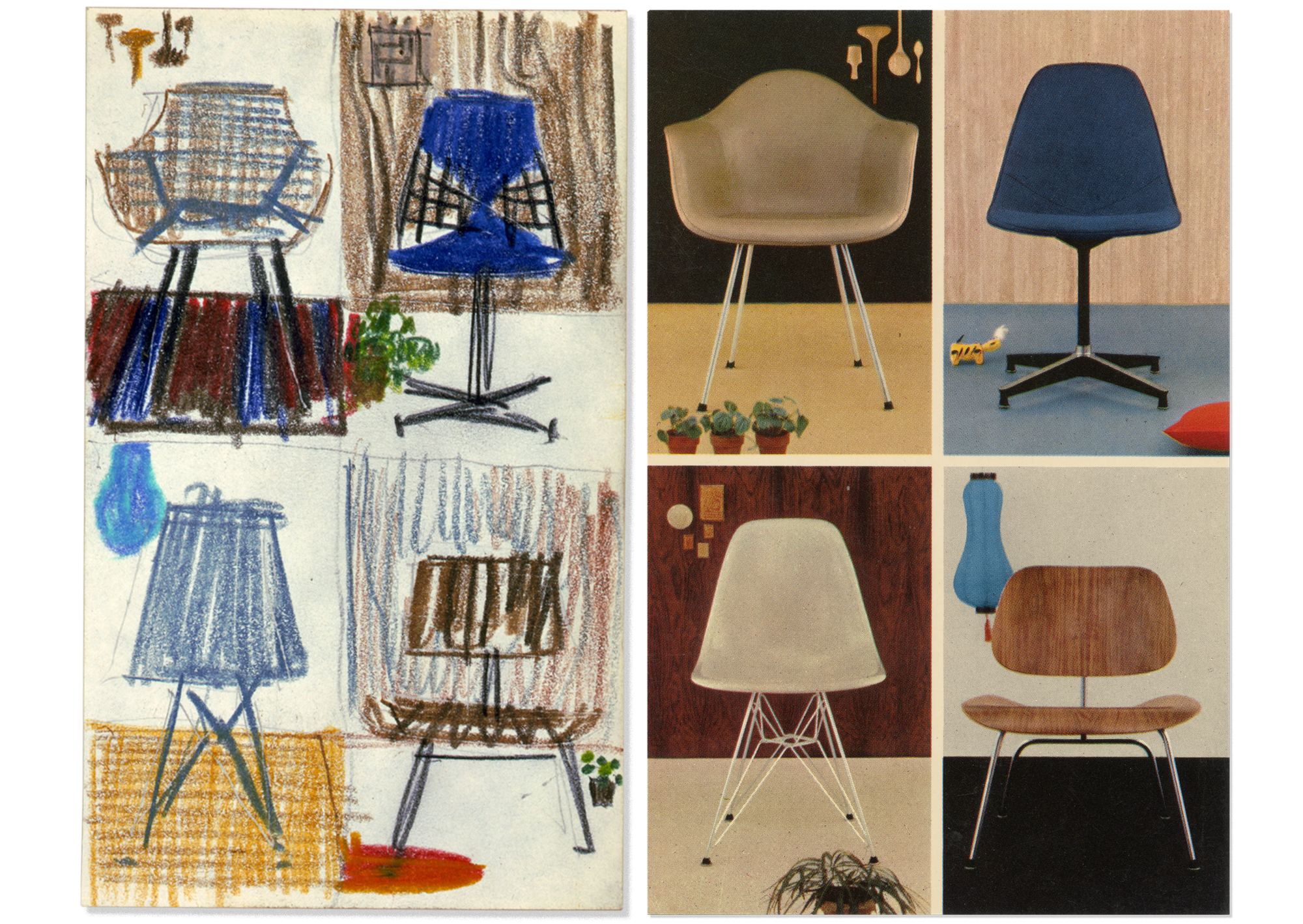
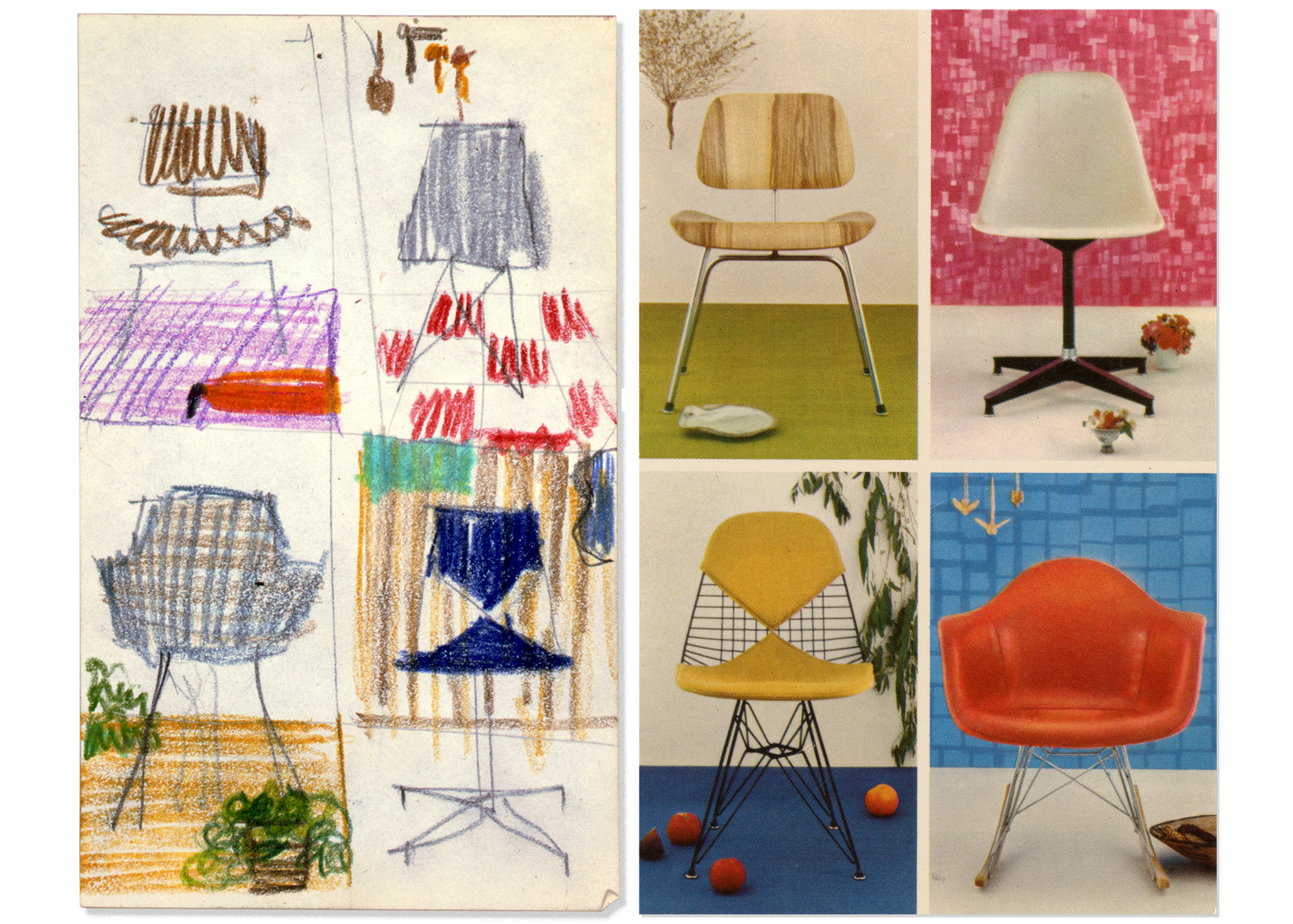
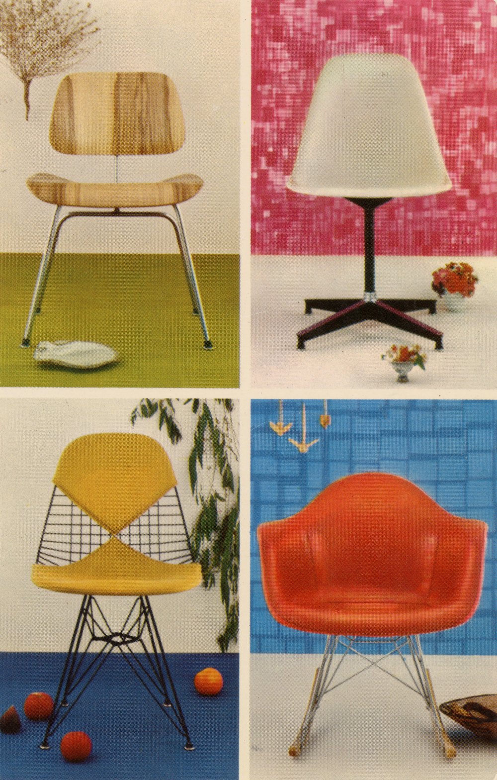
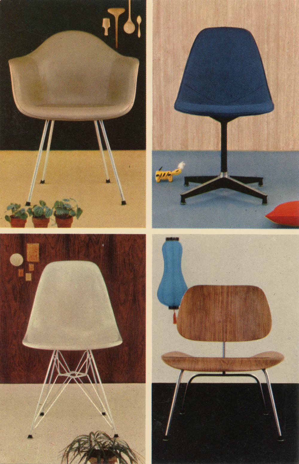
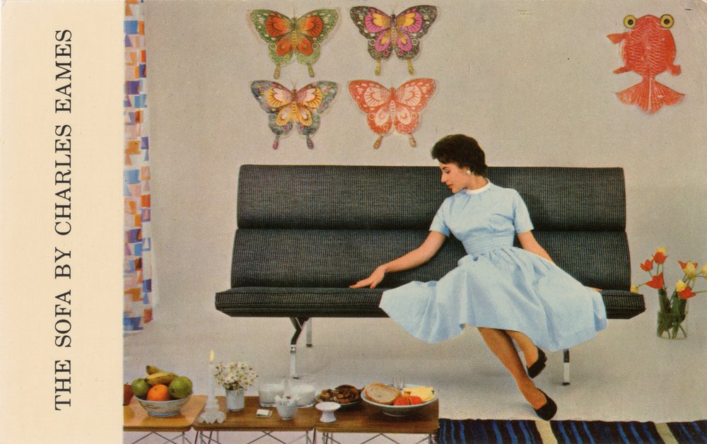
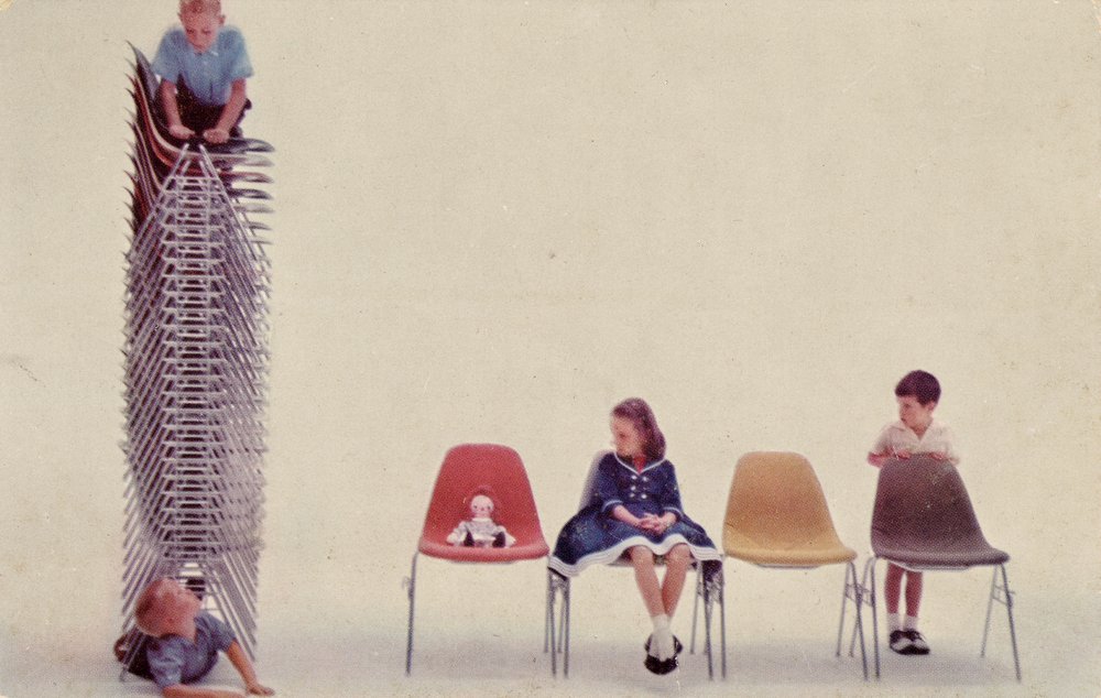
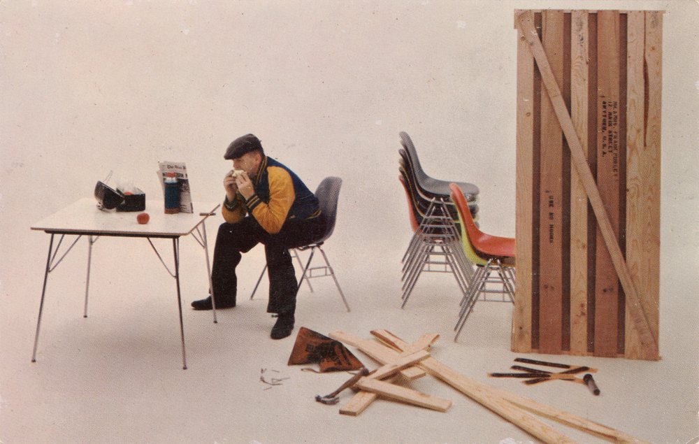
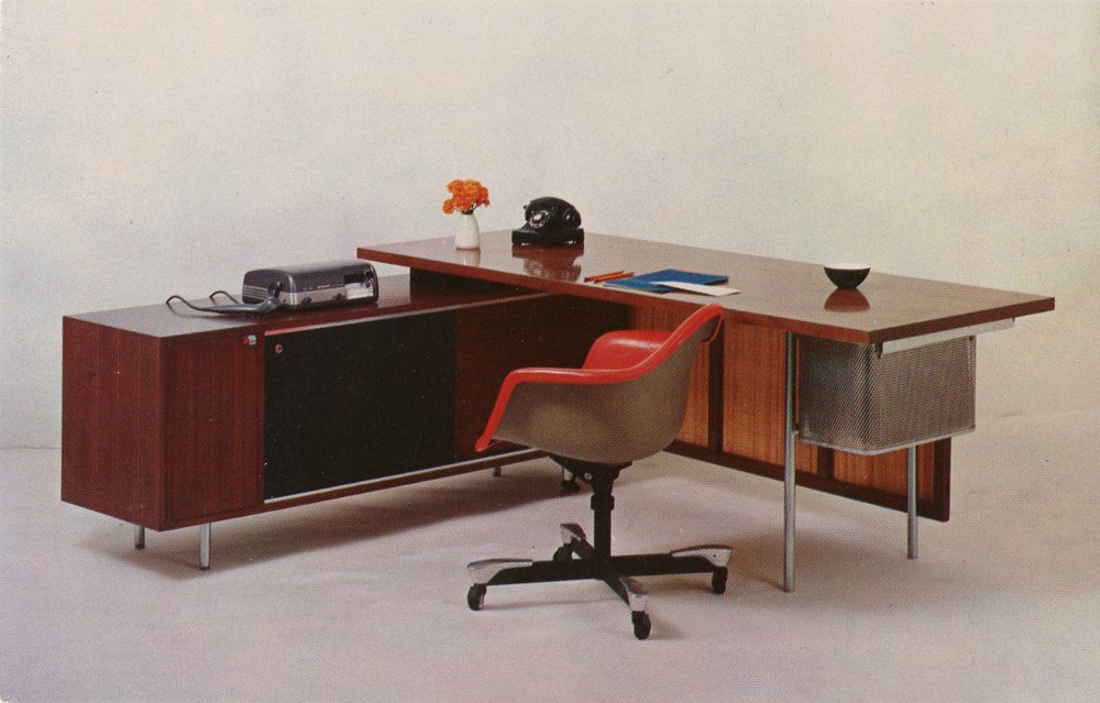
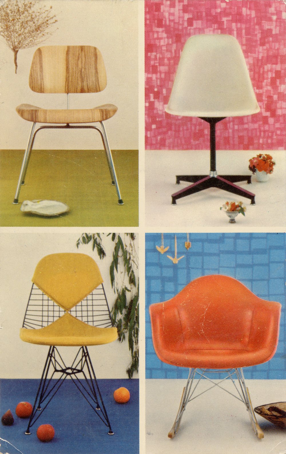
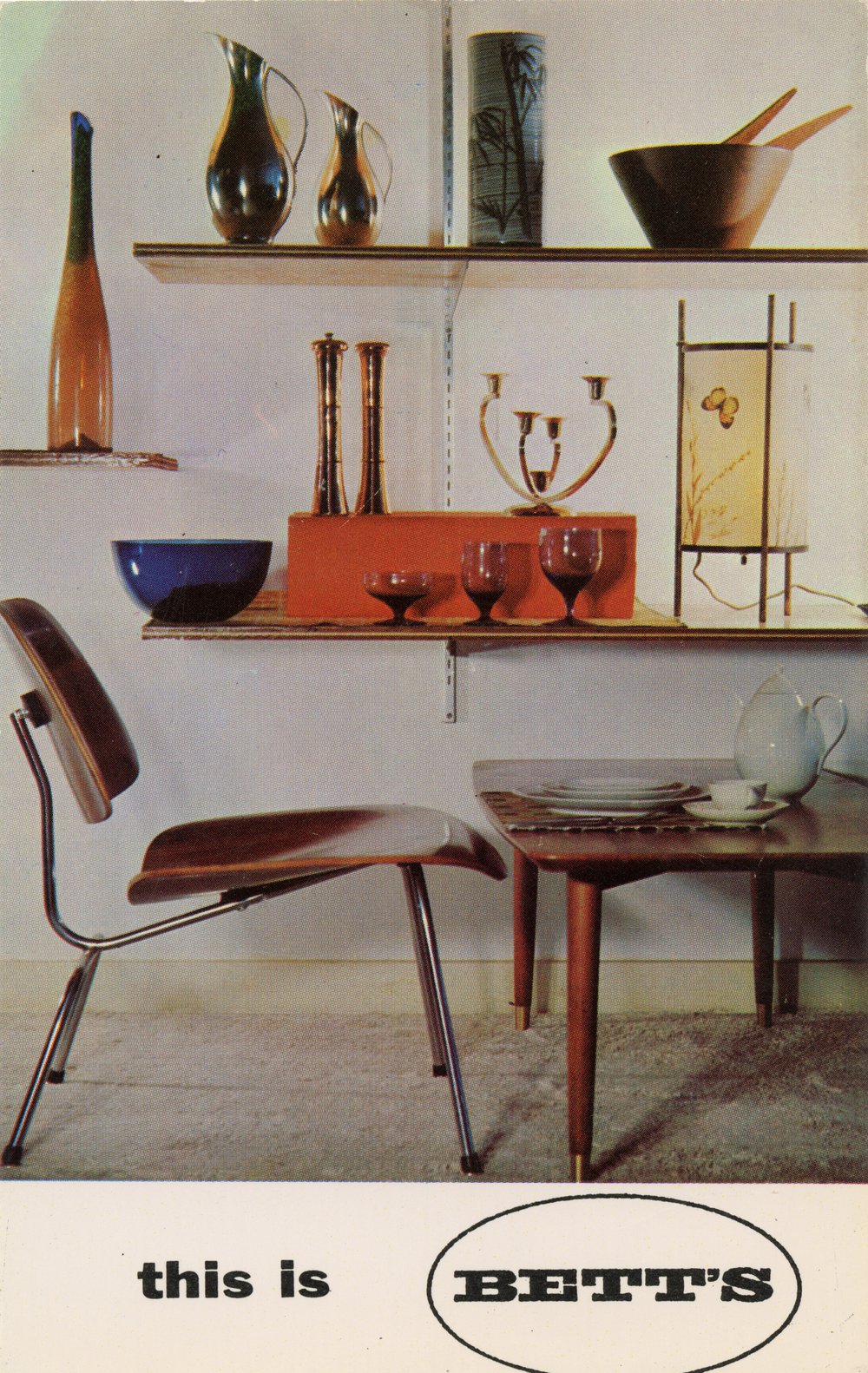
Ray and Charles designed a selection of promotional postcards for Herman Miller, which became the sole distributor of Eames Office–designed furniture in 1947. Under the design direction of George Nelson, the Michigan-based manufacturer had developed a sophisticated marketing strategy centered around the brand’s philosophy that its products are honest, that good design is an integral part of good business, and that the furniture should speak for itself. Images were an important part of this storytelling. Because Eames furniture was like nothing customers had seen before, advertising had to establish that the pieces would enhance their lives. Their products were meant for everyone, and promotional postcards, which Herman Miller salespeople mailed to clients and offered as takeaways in showrooms, reflected that.
The Eames Office viewed the creation of communications and marketing material related to their products as an integral dimension of their role as designers.
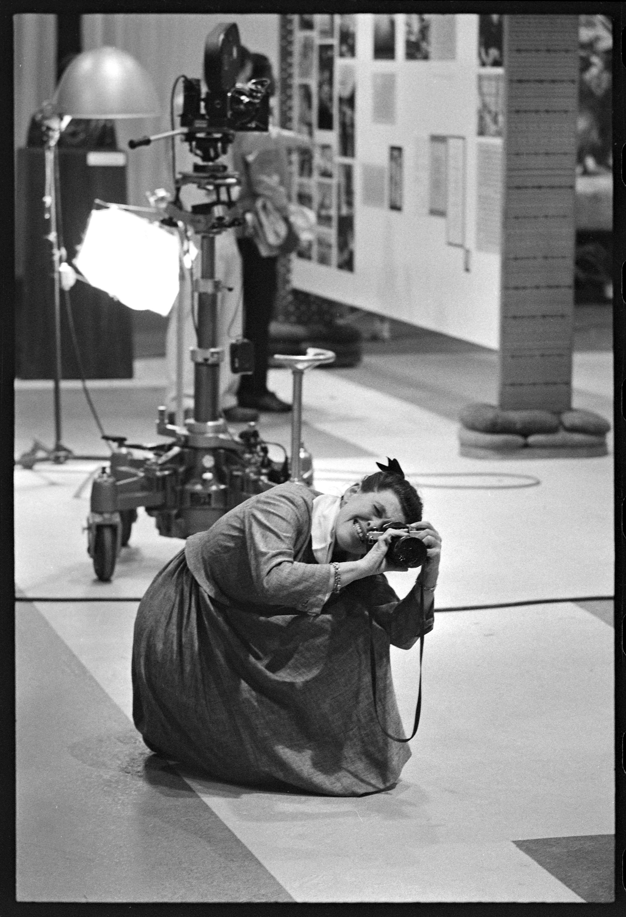
While the Eameses designed homes, furniture, and toys, image making was essential to every dimension of their practice. The camera was an indispensable tool for the Eameses, who obsessively documented their daily lives, their work, and their environments. With an anthropological eye, they used photography to study natural forms and manufactured objects, and harnessed the power of images to communicate their ideas about modern life and to construct their public persona. In the elaborately staged photographs that were intended for dissemination, every detail is considered: the styling, the lighting, the camera angle. Each element in an image contributed to the overall message the Eames Office wanted to convey—whether it was to impart a sense of wonder, to spark curiosity, or to offer a way for people to see themselves alongside their designs. There are hundreds of thousands of photographs in the Eames archive at the Library of Congress, and many thousands more in the Eames Collection. Eventually, this love of images led the Eames Office to produce over 125 short films. “For many years we have used photography as an information tool,” Charles wrote in 1969. “As the information we needed to communicate developed greater urgency and complexity, we got more and more involved in the medium of motion picture—multi-image—collections of stills.”
The Eameses Send Postcards
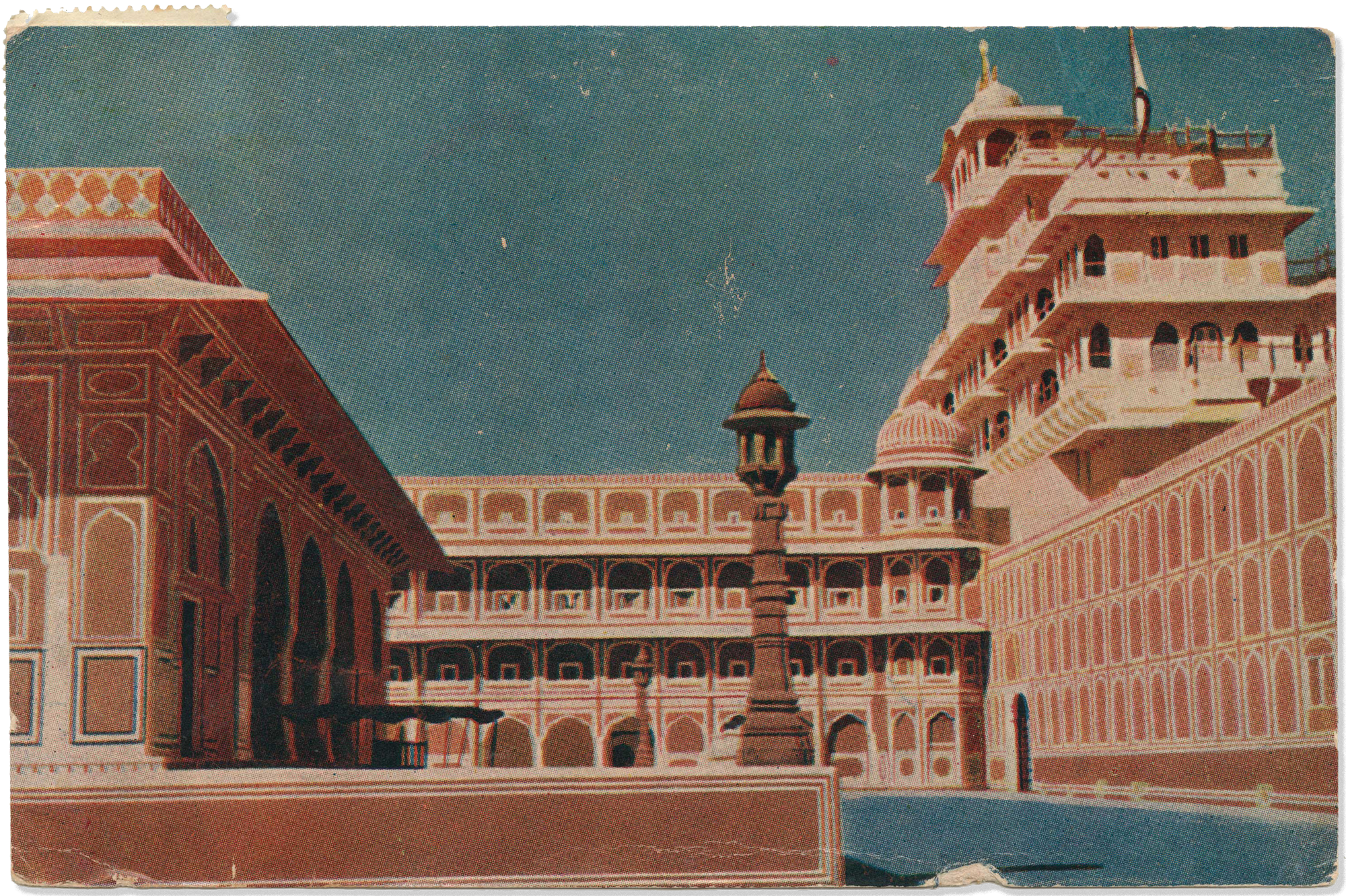
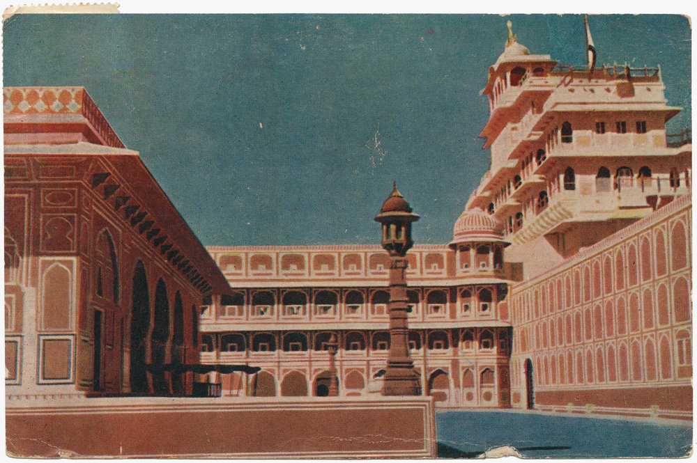
City Palace Jaipur
postcard sent by Ray Eames
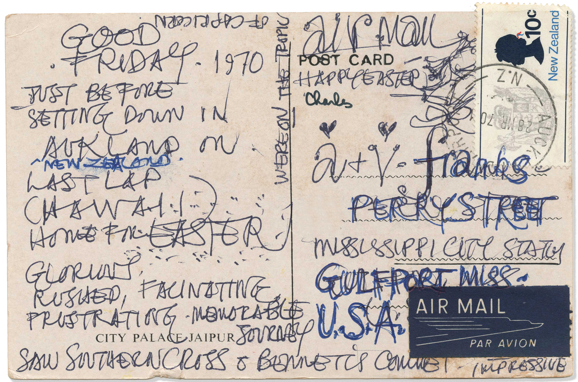
City Palace Jaipur
postcard sent by Ray Eames
The Eameses’ correspondence is a window into their day-to-day lives. They frequently wrote letters to their friends and colleagues around the world, showing the international reach of their relationships. In formal letters to their business associates, we see how they addressed design and manufacturing challenges. Ray and Charles sent postcards to each other and to their family, and this personal, casual correspondence offers a glimpse of their private lives.
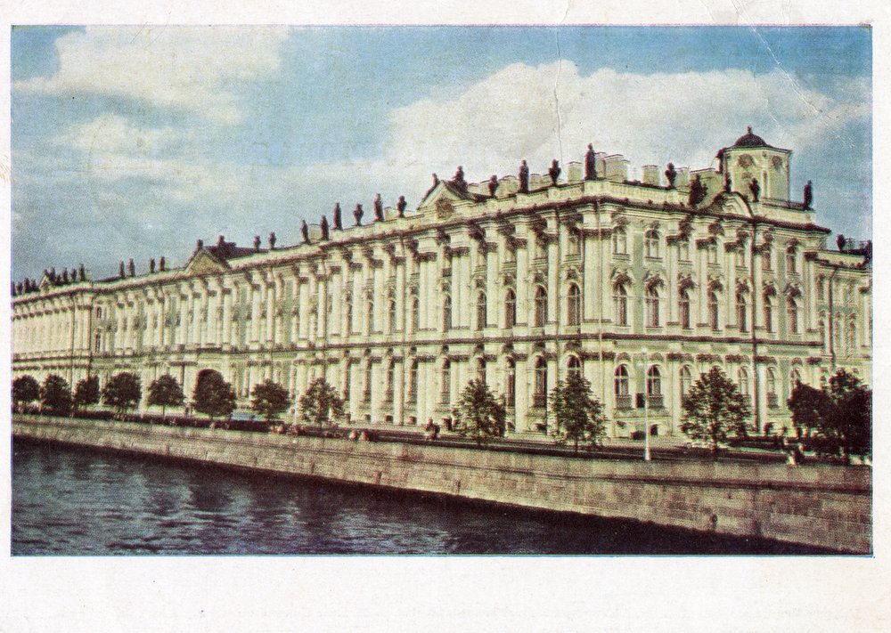
As the Eameses’ profile rose, they began to frequently travel for commissions, lectures, and research. And like everyone else at the time, they collected and sent postcards from their destinations. In the 1960s, the Eames Office worked on the exhibition design for a National Aquarium that was to be built in Washington DC but was canceled after budget cuts. Their research involved visiting cultural institutions around the world, like the Hermitage Museum in St. Petersburg. Charles selected a postcard from the institution to send to his sister, Adele, and brother-in-law, Vincent, in Mississippi and wrote a simple message of “Love, Charles” in Russian characters. In 1970, Charles and Ray went on a marathon month-long trip that included stops in Europe to promote their Soft Pad seating collection and in India, where they were working with the Indian government and the Ford Foundation on a curriculum for the National Institute of Design in Ahmedabad. Ray, writing to Adele and Vincent on a postcard of the bright-pink City Palace of Jaipur, described the journey as “rushed, fascinating, frustrating, and memorable.”
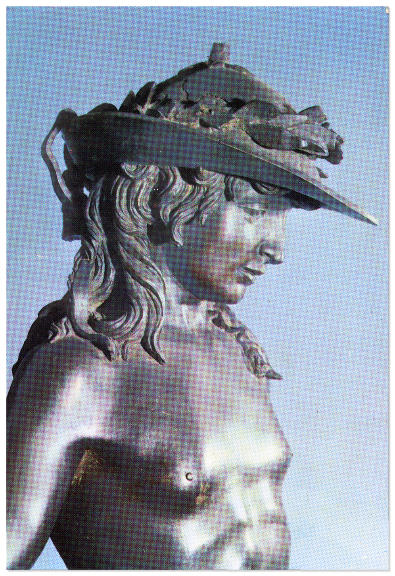
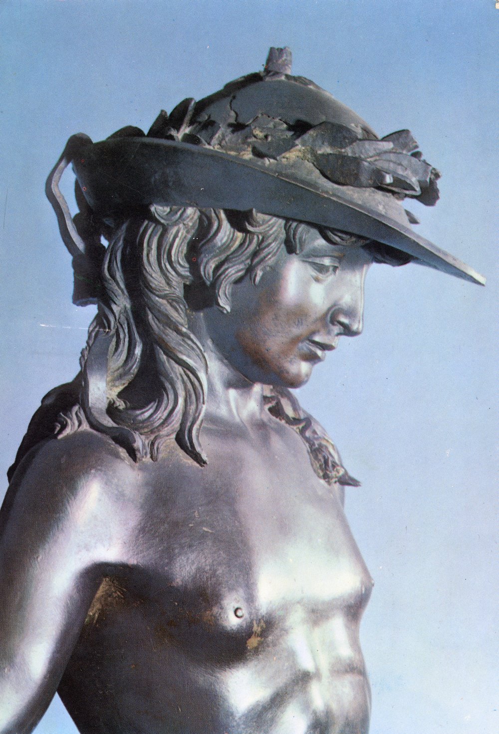
David (Particolare), Donatello (1386–1466)
postcard sent by Charles Eames
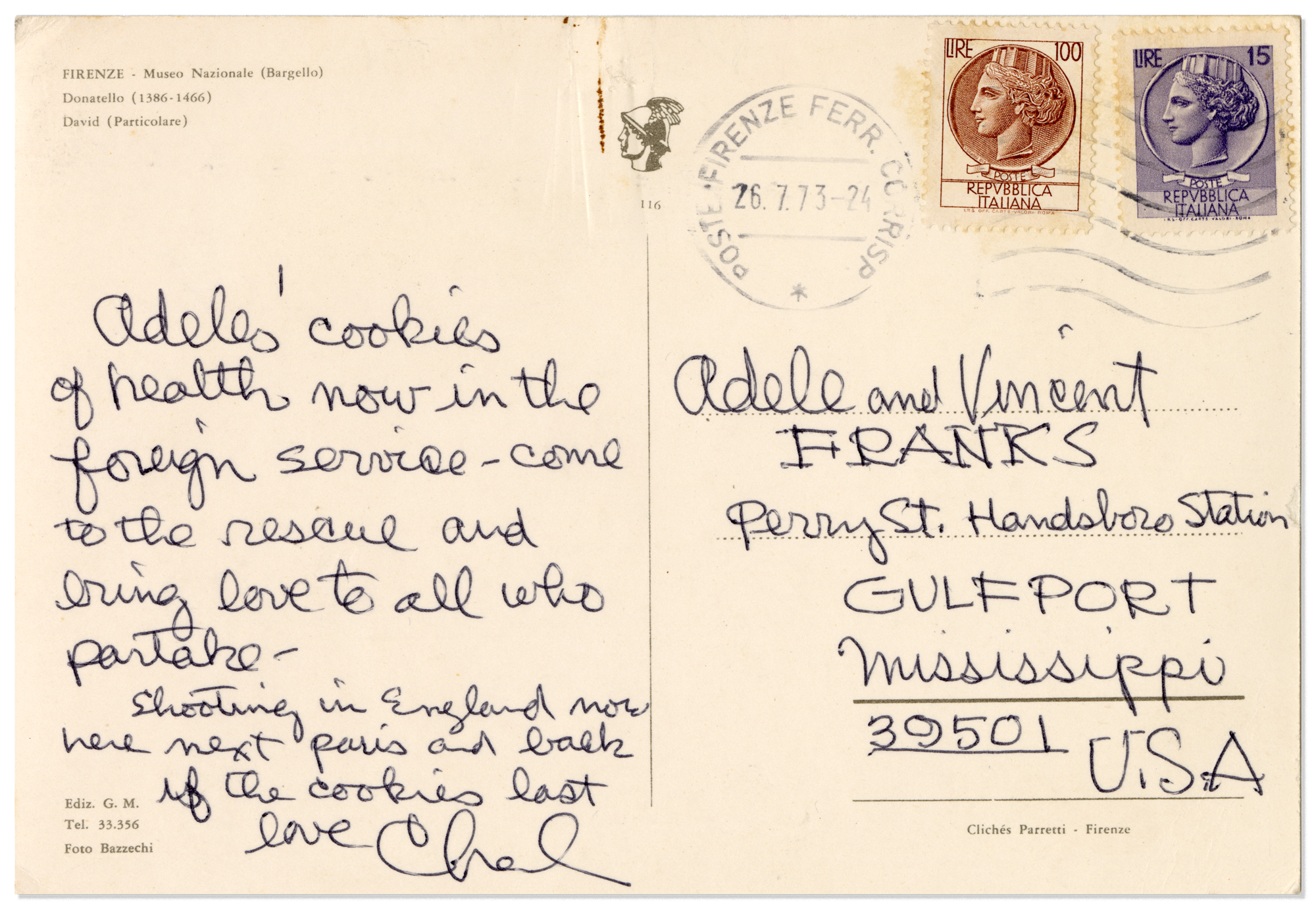
David (Particolare), Donatello (1386–1466)
postcard sent by Charles Eames
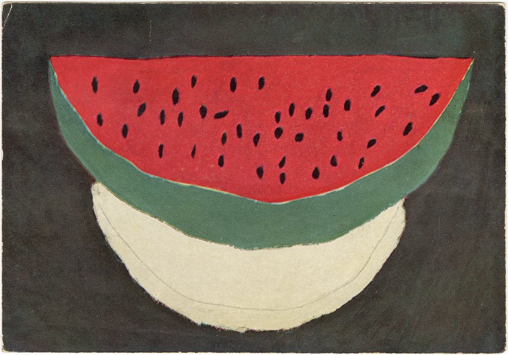
Postcards also served as reminders of visual references that informed Ray and Charles’s work. They understood groupings of images as examples of relationships, such as the photographs of African combs, Chinese firecrackers, seeds, and buttons on their House of Cards toy that together signaled a pattern of nostalgia. Similarly, the postcards Ray and Charles mailed, or kept for themselves, reveal the imagery they were drawn to at a specific moment. In 1955, Charles traveled to France while working as a photographer for the film The Spirit of St. Louis. While on location, he sent a note to Ray detailing the remarkable meals that were provided to the film crew each night and aptly chose a postcard with a watermelon painted by a child for the message.
Eames-Spotting on Postcards
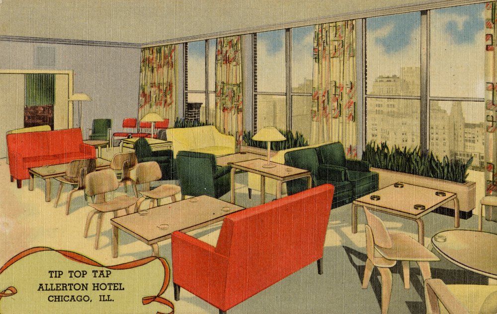
Postcards featuring Ray and Charles’s work, but not made by them, are enduring examples of the resonance of their work. Their furniture captured the imagination and attention of people who encountered it, enough so that it was used to symbolize modern, forward-thinking sensibilities before and after Ray and Charles became celebrities.
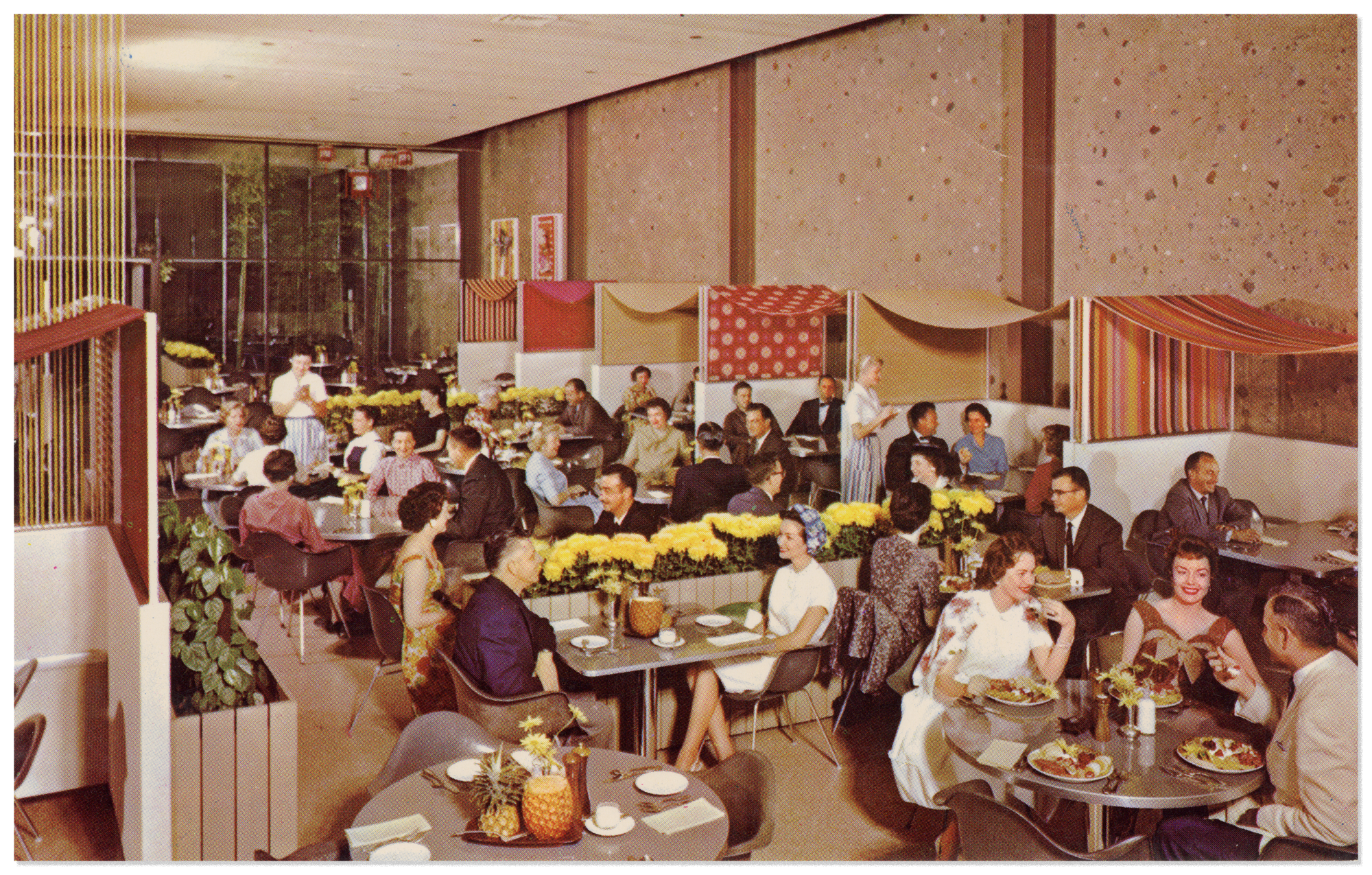
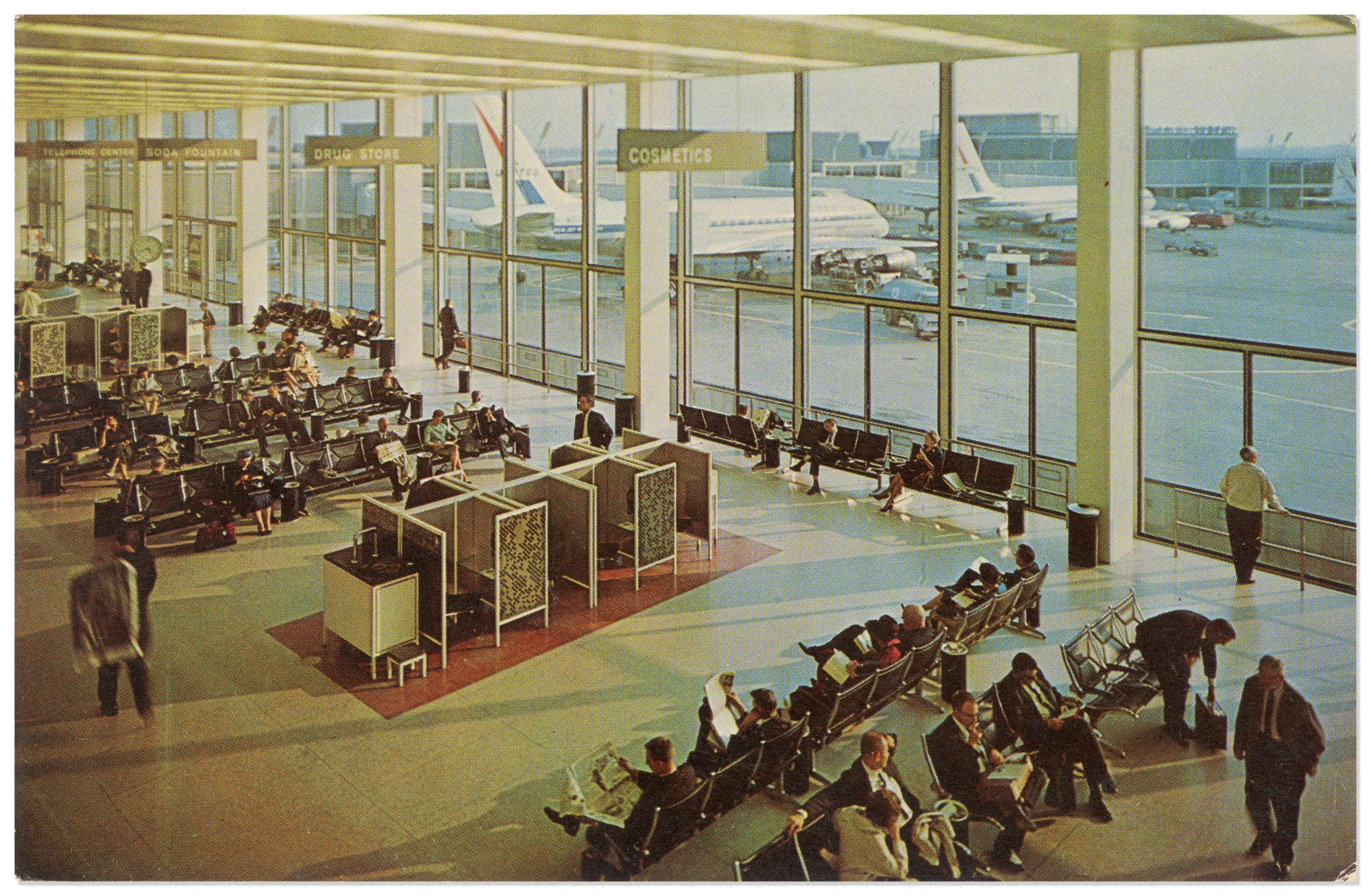
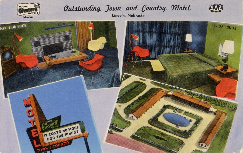
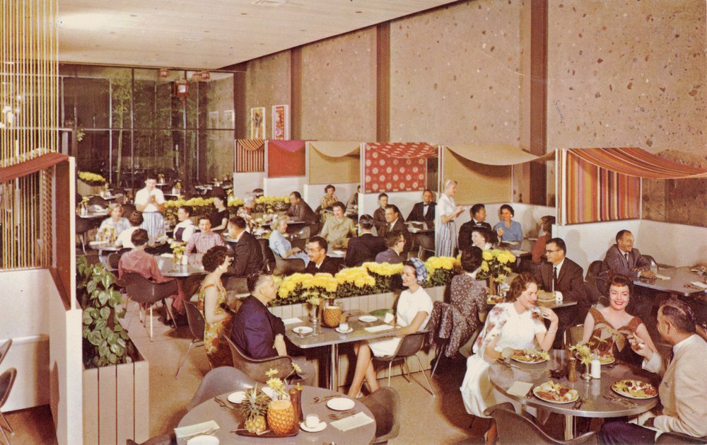
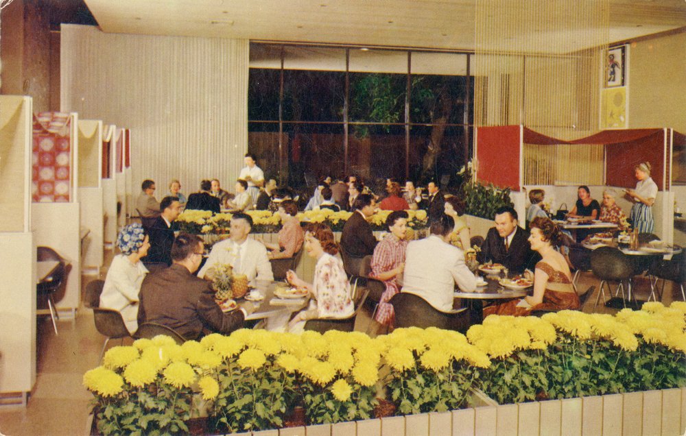
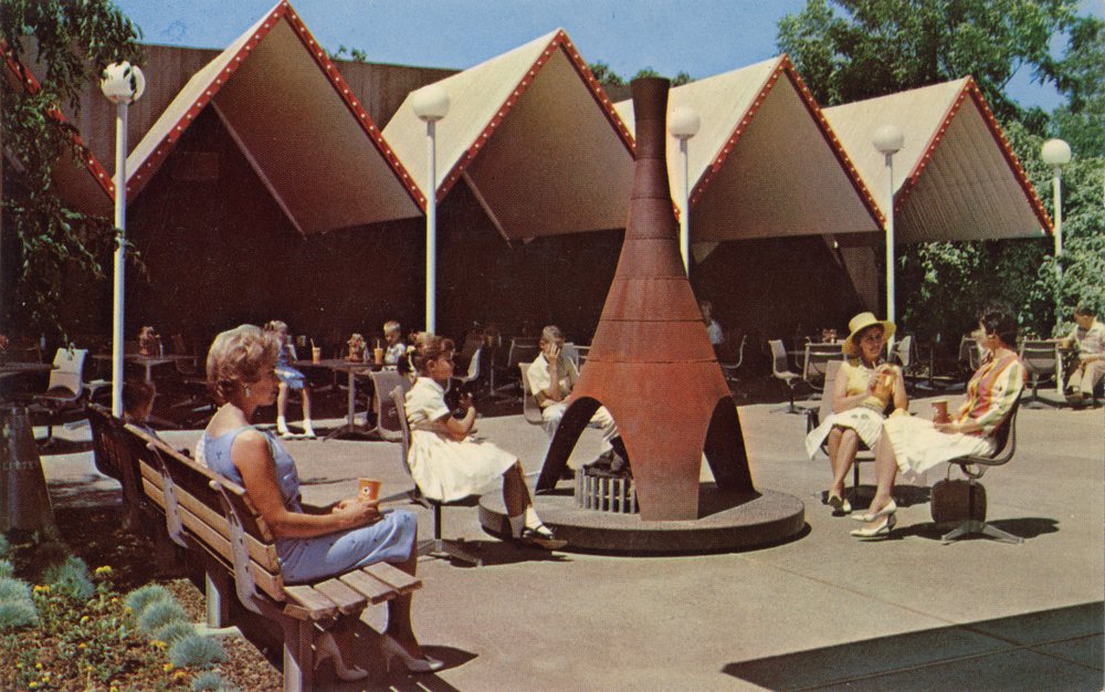
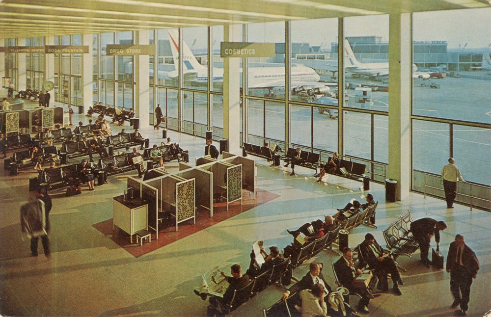
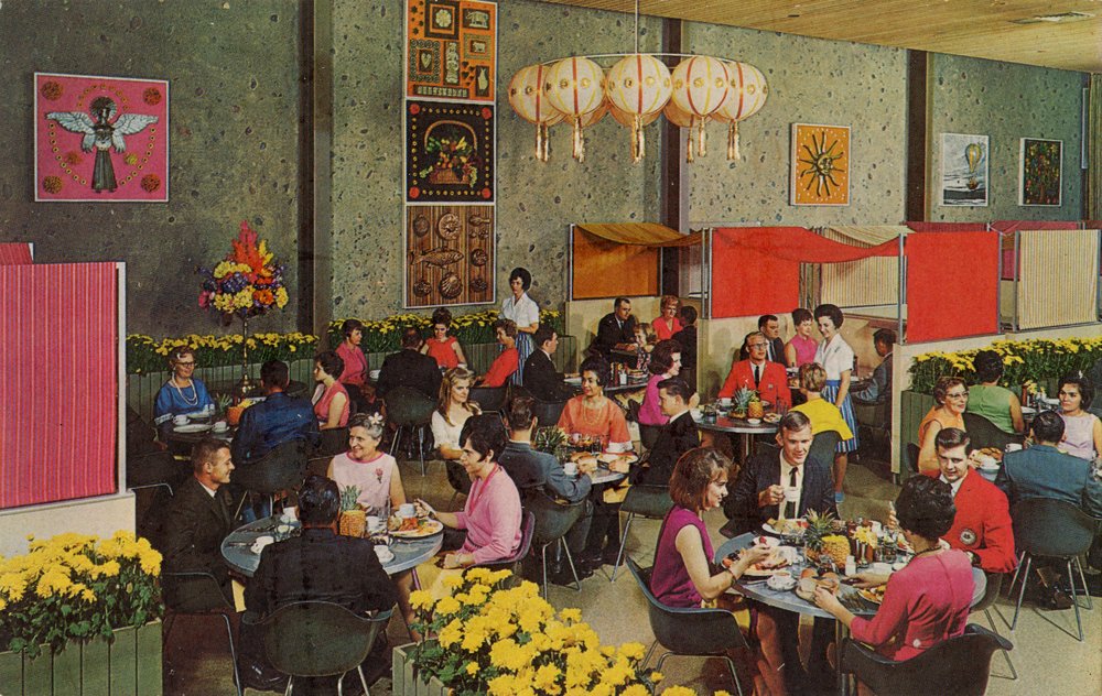
The wide array of businesses that chose to feature Eames designs on promotional postcards illustrates the ongoing popularity of their work. The Town & Country Motel in Lincoln, Nebraska, promoted its “luxurious rooms” by showing its bridal and fireside suites furnished with Eames Shell Chairs on a 1954 postcard. The Nut Tree, an attraction and amusement-filled destination that opened in 1921 in Vacaville, California, was a popular rest stop for families traveling from San Francisco to Lake Tahoe. (It also happened to be among the earliest authorized retailers of Herman Miller furniture.) Shell chairs were found throughout the restaurants and shops, and Aluminum Group seating offered places to sit outdoors, as 1965 souvenir postcards show. The descriptions promote “America’s newest cuisine, Western Food” and never directly mention furniture or architecture, but Eames designs support the Nut Tree’s ambition to offer visitors a completely modern experience. A similar strategy is reflected in a 1964 postcard from O’Hare Airport in Chicago. It touts a new terminal’s “exciting panoramic view of modern day jet travel activities” and shows people sitting in the Tandem Sling Seating system, which Charles and Ray developed in 1961 with Herman Miller’s special products division expressly for O’Hare—and endures as the paragon of airport seating.
Postcards—and Eames designs—were fixtures in the visual culture of the 20th century. The observant collector will find countless examples where the two intersect.
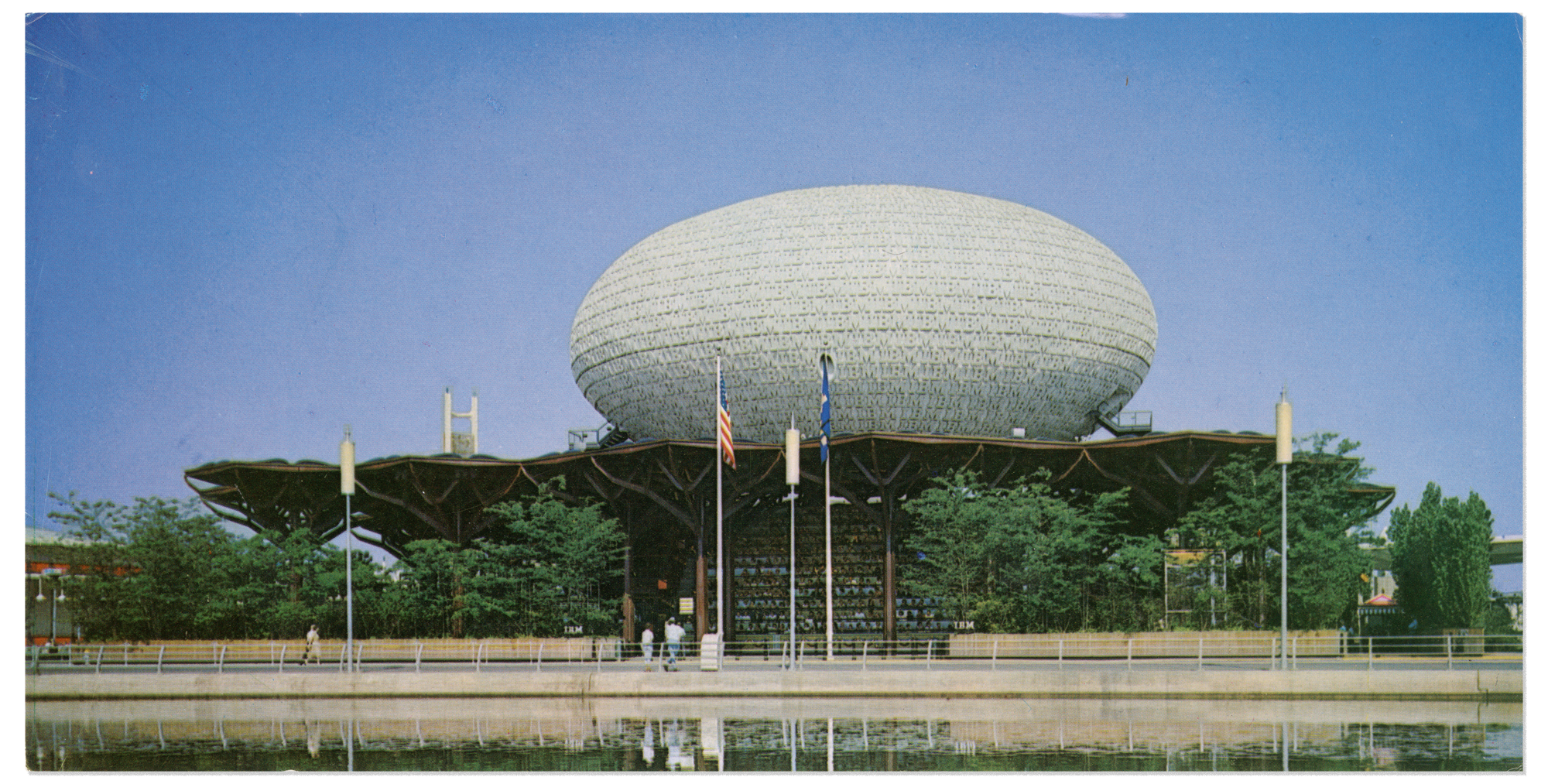
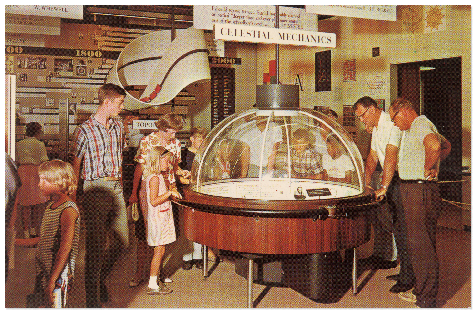
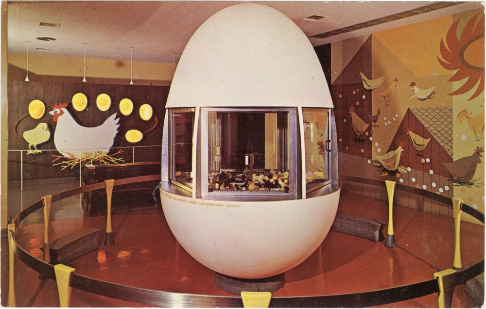
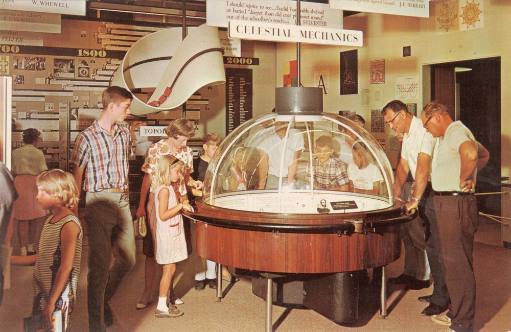
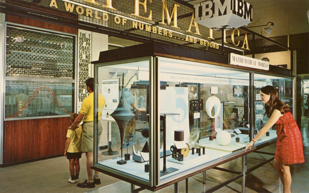
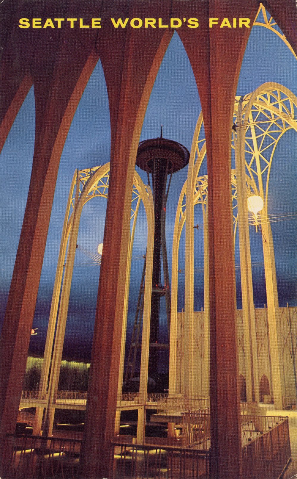
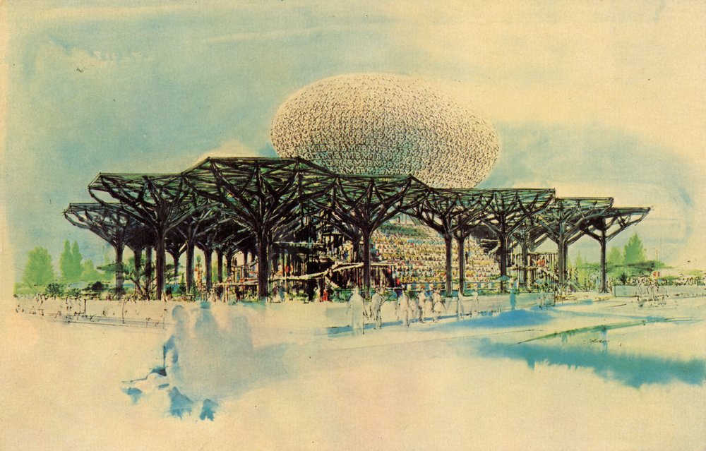
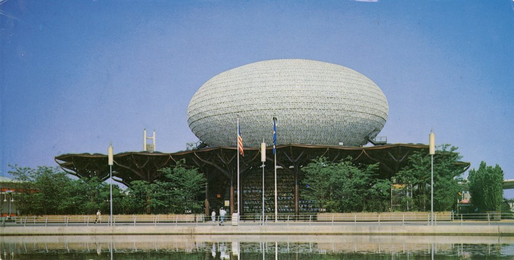
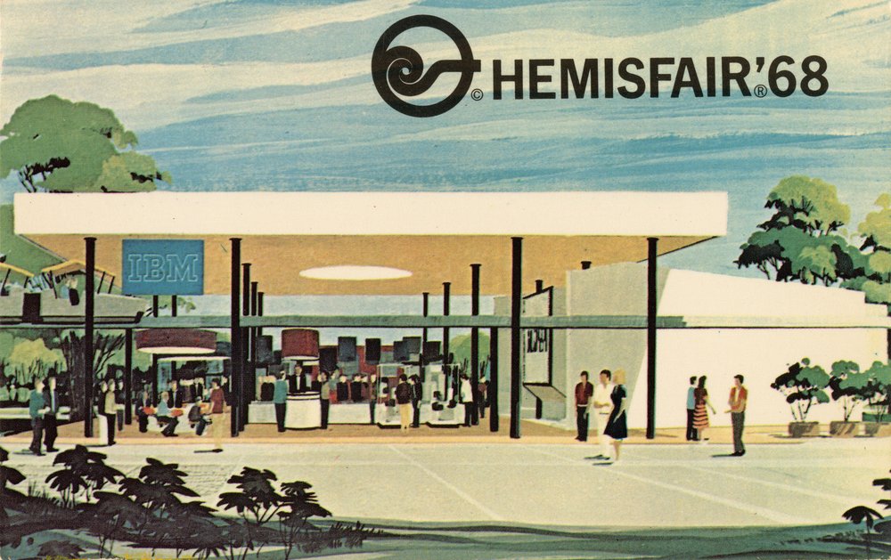
Millions of people encountered the work of Ray and Charles through their contributions to World’s Fair pavilions and exhibitions. Ray and Charles kept postcards from their Mathematica: A World of Numbers … And Beyond exhibition, which was first installed at the California Museum of Science and Industry, in Los Angeles, before other iterations of the exhibit were created for the Museum of Science and Industry, in Chicago; the 1962 World’s Fair in Seattle where the Eameses’ multi-screen House of Science film was screened; and finally, the Eames and Saarinen-designed pavilion for IBM at the 1964 New York World’s Fair. Harkening back to 1893, these souvenir postcards are among the most widely circulated artifacts from these ephemeral events—a way for them to live on long after the pavilions were dismantled.
The Eames philosophy of making the best for the most for the least—a motto that emphasizes their interest in affordable, high-quality, mass-produced design—might be best demonstrated by postcards, which offer accessible avenues for people to “own” an Eames design. Today, there are untold numbers of Eames fan pages and accounts on digital platforms that share photographs related to their work. But postcards comprised the first global “social network” of Eames imagery, which is kept alive today by collectors who prize tangible media. ❤
—Essay by Diana Budds
—Illustrations by Jim Datz
Explore All Artifacts
Dive into the exhibition—item by item. Clicking on an entry takes you to an artifact detail page containing pertinent details, more images, and in the case of some objects, curatorial notes.
