House of Cards Mock-up Process (Box 2)
Ray Eames
1952
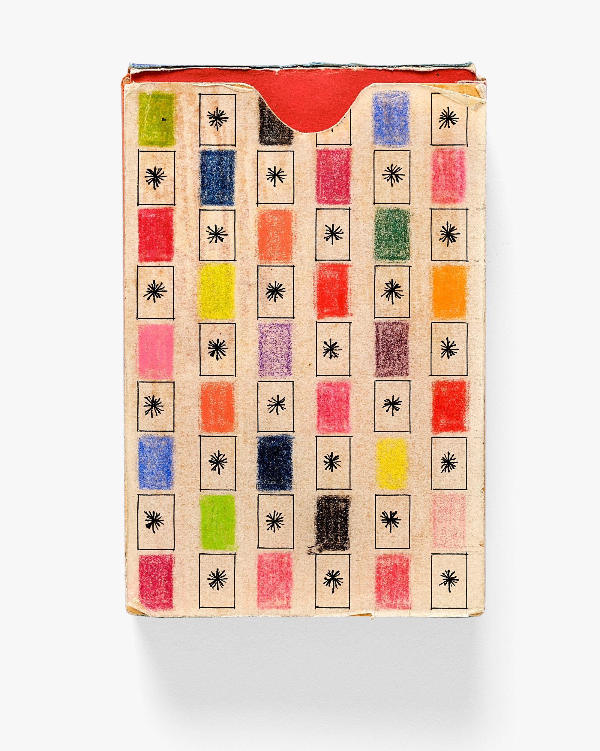
Ray made this mock-up for one of the many different House of Cards boxes that appeared over the years. The Eameses took a holistic approach to product design, considering the marketing and packaging of their work as carefully as the products themselves. They also did not believe a design was finished just because it was put into production, and often continued to modify their designs in the years after they were introduced. When it came to the House of Cards, the Eameses continued to design new packaging for their popular construction kit long after it debuted in 1952. This mock-up’s meticulous crafting offers evidence of Ray’s detailed attention to matters of color, form, and composition. She combined paper, crayon, and ink on a pack of Bicycle playing cards to create an all-over pattern of small rectangles arranged in a neat grid. The solid-colored rectangles allude to the brightly colored patterns on the front of the cards; these alternate with delicately inked depictions of the cards’ reverse side, which bore an asterisk. Here, the symbol appears in black, but on the actual cards it was printed in gold and often described as a sunburst.
- Medium:Collage on wood block
- Dimensions:3 5/8 x 2 1/2 x 3/4 in. (9.2 x 6.4 x 1.9 cm)
- Item:T.2019.2.306


